Guess what? Email remains one of the most valuable digital marketing channels for online stores of all sizes.
If you want to build a successful email marketing program, you’ll need:
- An engaged & growing email list
- Create beautiful email designs
- Craft powerful subject lines that get emails opened
- Create valuable email content that gets people to click
- Plan your email campaigns around major retail holidays and the buyer journey
Designing the perfect email requires some planning as well as a creative mindset. It’s also knowing what customers want during each stage of their buying cycle.
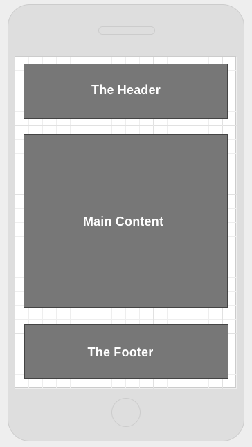
An email is usually structured into 3 parts:
- The Header
- The Main Content (offer)
- The Footer
The main content may include many offers.
Why Is An Email Header Important
The header in your email occupies prime real estate. It’s the first thing someone sees when they open your email message. It’s even more important than ever since real estate is limited on a smartphone screen.
There are 3 reasons why you need an email header:
- Branding
- Communicating your offer
- Simplifying the shopping experience
How to Design An Email Header
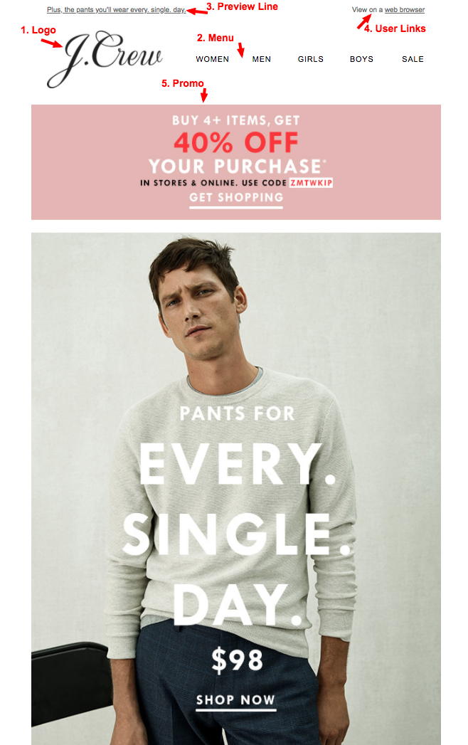
A well structured email header should include these 5 elements:
1. Logo
A logo helps with branding and establishing trust.
2. Menu
A menu helps remind subscribers what you sell and quick provide quick links to browse your online store
3. Preview Line
A preview line helps support your subject line. It highlights some details on what to expect in the email.
4. Promo
A promo or the offer is a great way to highlight a specific offer that will entice customers to take action. It can also be used to communicate an initiative on your website such as an event or site wide offer (free shipping over $x).
5. User Links
User links are aimed at helping subscribers either access specific areas of the site such as their account or help improve email viewability.
Should you include all of those elements in your design? It really depends on your goals. My advice is to test everything to see what works best (find elements that grab attention and increase clicks).
13 Ways to Design the Perfect Email Header
To help you create or improve the design of your email header, I’ve gathered a bunch of examples from actual email campaigns sent by eCommerce businesses of all sizes.
This should help you figure out what to test by combining different email header elements.
Note: If you want to enlarge screenshots, simply click the images.
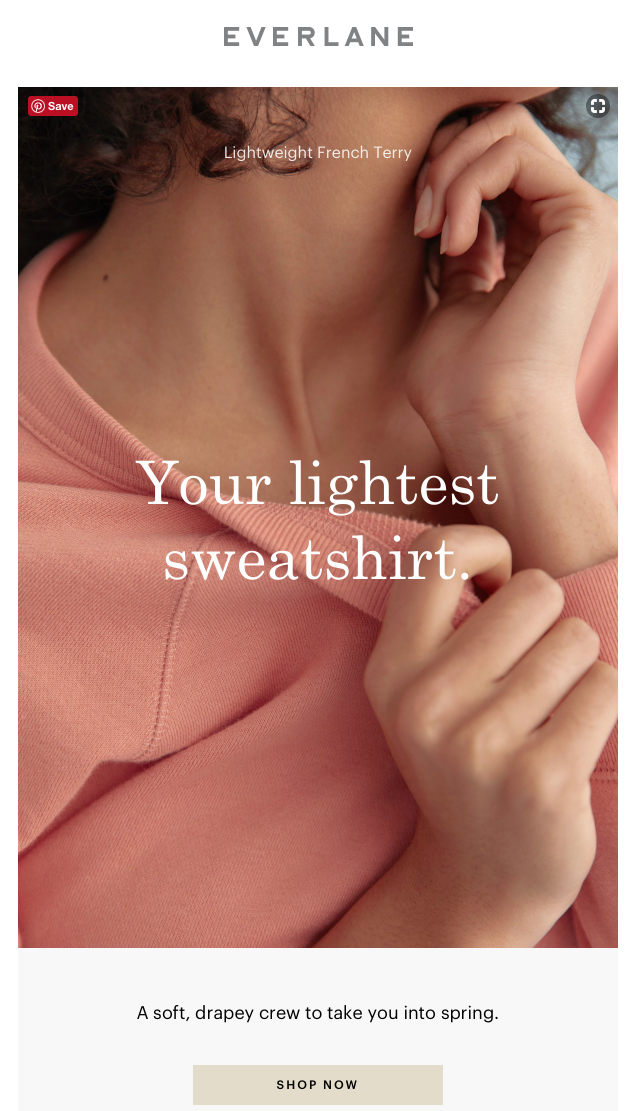
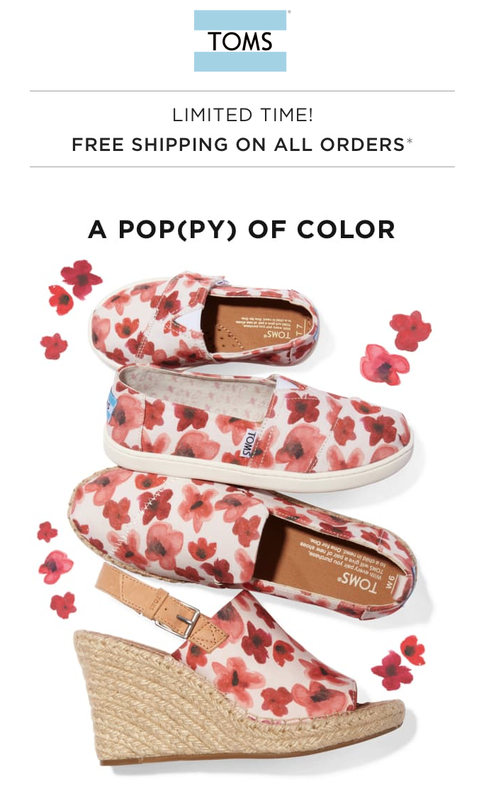
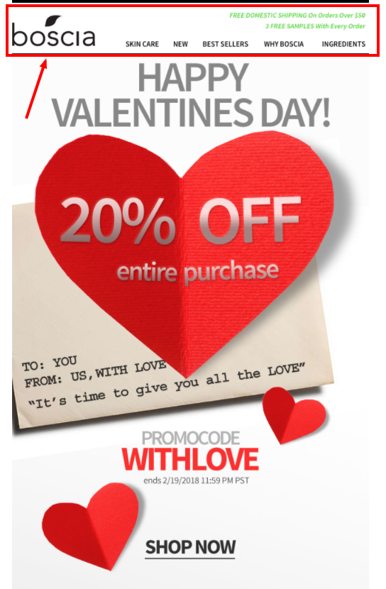
1. Email header with LOGO only
Some retailers like to keep simple and remove all distractions by simply displaying only their logo. Sometimes a logo can also be displayed with a slogan.

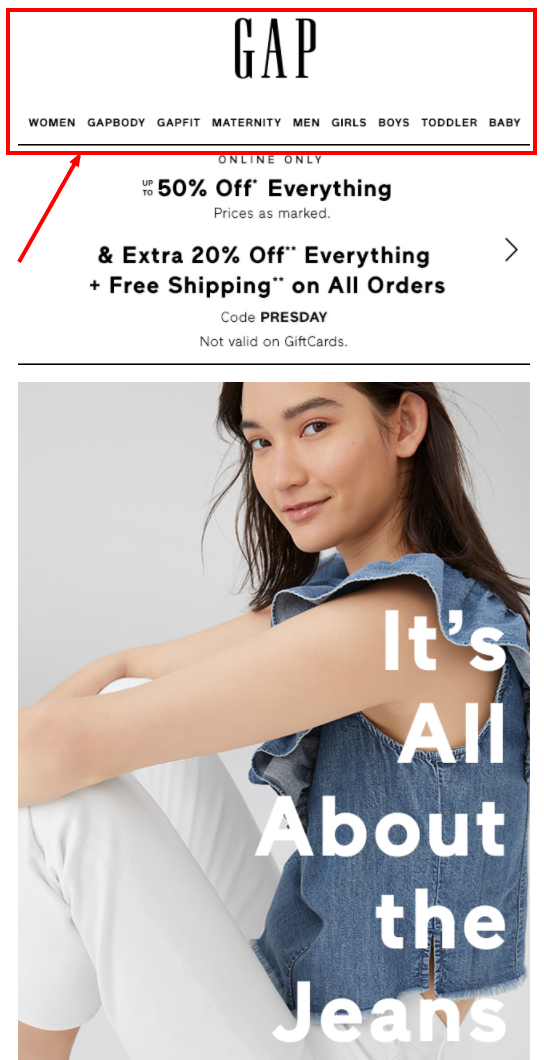
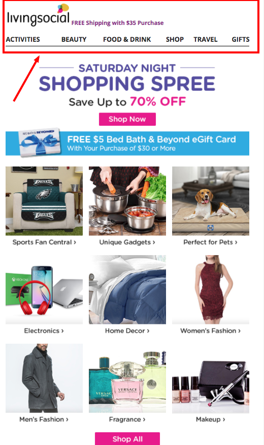
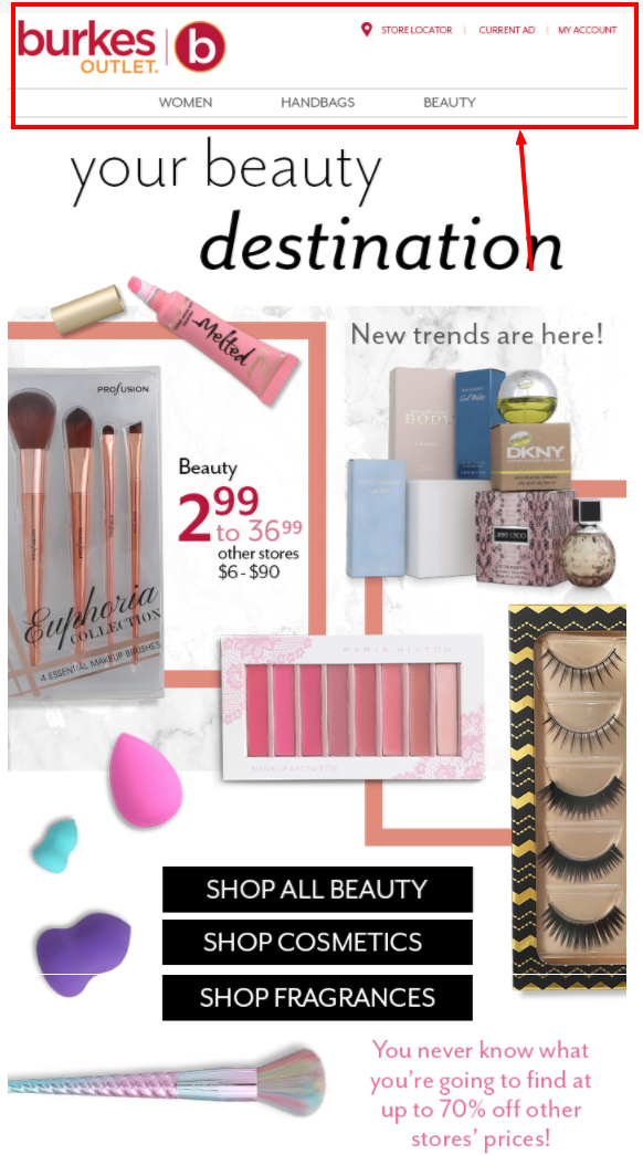
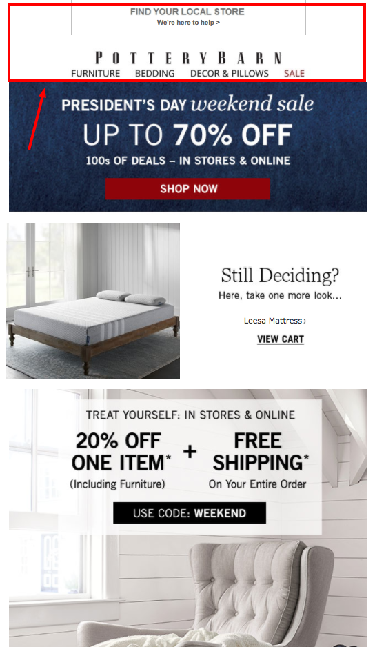
2. Email header with a LOGO + Menu (bottom)
I personally like it when retailers include a menu. It’s a great way to drive traffic to your online store in case the email promotion is not of interest to the customer. It’s also a great way to remind shoppers the type of products you sell.
When adding a menu, consider testing different links as well as personalizing them to the email recipient. For example, if the customer is a women, then show menu links that relate to product categories for women.
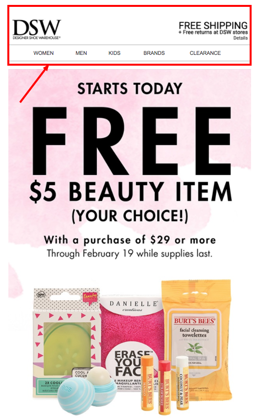
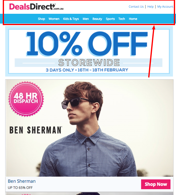
3. Email header with a LOGO + MENU (side)
You can also display your menu to the right side of the logo. This can help save some space in the email but remember to test it on mobile devices since it’s a smaller screen. You need to make sure it doesn’t ruin the layout of the menu links.
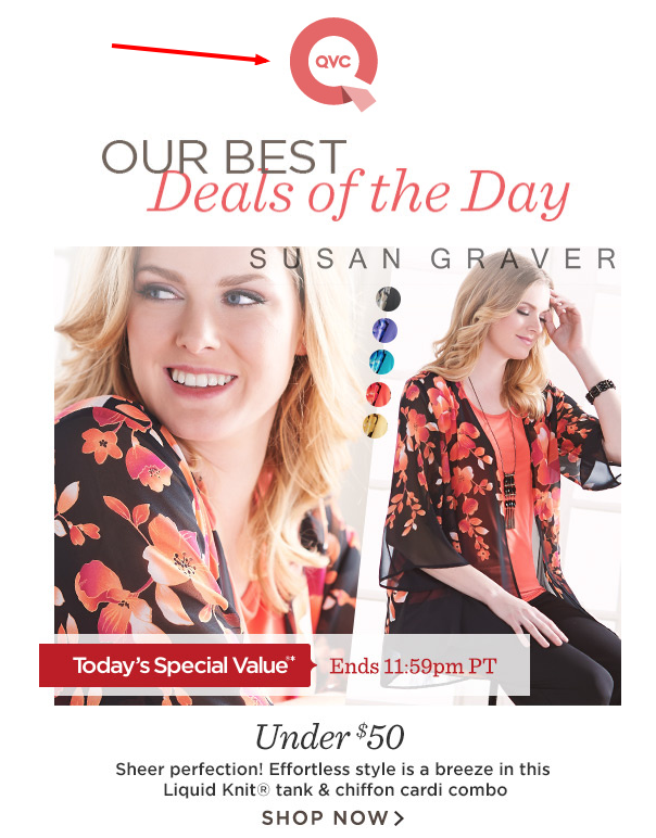
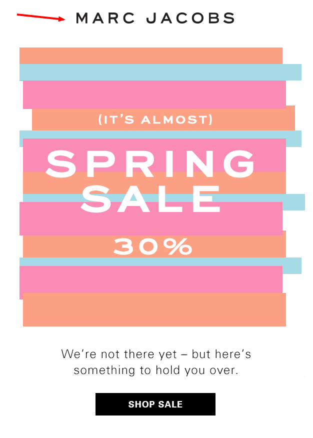
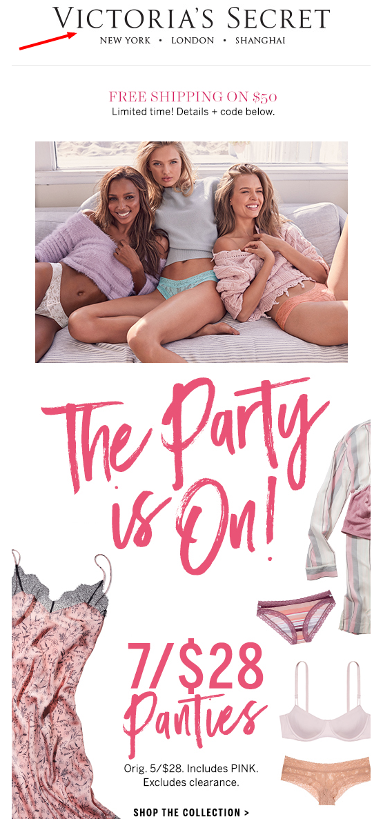
4. Email header with PROMO + LOGO
If you have an aggressive promotion or if you want to make sure people are aware of it, you can display it before of your logo (top).
5. Email header with LOGO + PROMO (side) + MENU (bottom)
You can also add your promo to the side and simply move the menu to the bottom.

6. Email header with PREVIEW LINE + LOGO + MENU (bottom)
Use the preview to highlight additional information about the sale or even highlight a separate offer that is included in the bottom of the email. It’s prime real estate. Use it wisely!
7. Email header with LOGO + USER LINKS + MENU (bottom)
Displaying user links is great especially if you’re sending your messages to actually customers. Provide them links to their account, update preferences of even find out opening hours of the closest store location.
8. Email header with PROMO + LOGO + MENU (bottom)
The preview line can sometimes be replaced with a promo offer. Personally, I always recommend to have a preview line written in text and avoid using an image. A preview line in text will be displayed in the inbox preview along with the subject line and sender’s information.
9. Email header with LOGO + PROMO (side)
A promo on the side of the logo can help turn attention towards an important offer or message you want your subscribers to see.

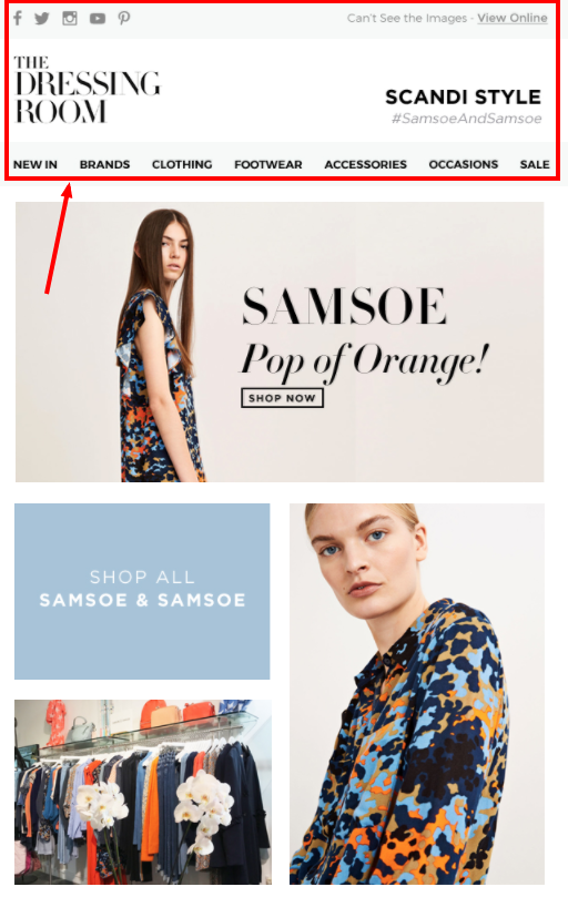
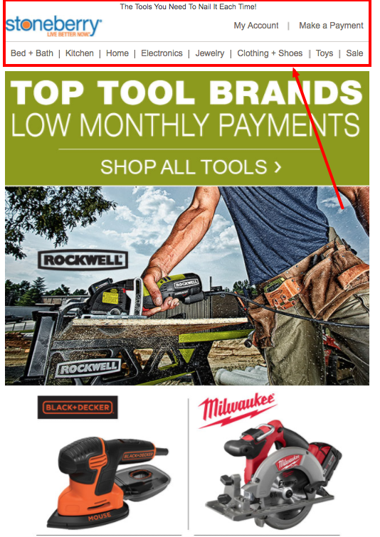
10. Email header with PREVIEW LINE + LOGO + USER LINKS + MENU (bottom)
If you decide to use most of the elements, make sure to keep it simple. You don’t want to overwhelm users with too many links to click on or having too many words to read.
11. Email header with PREVIEW LINE + USER LINKS + LOGO + MENU (side)
I love this design. It’s clear and simple.
12. Email header with LOGO + PROMO (side) + MENU (side)
Adding a simple promo to your email header can sometimes help boost clicks to your website especially if it’s a sidewide promotion or limited-time offer.
13. Email header with USER LINKS + LOGO + PROMO (side) + MENU (bottom)
Finally, the only thing missing from this design is the preview line.